BRand Design for can can
Can Can, known for its adaptability and transformation, has undergone significant branding variations throughout its nearly two decades of existence. Demonstrating this evolution, Can Can recently opted to elevate its branding by incorporating darker tones while preserving its signature gold aesthetic. This aesthetic choice serves as a nod to the theater’s luxurious decor and distinct personality, creating a visually striking and cohesive brand identity.
BRand Design for Mad MYrna’s
For over two and a half decades, Mad Myrna’s has remained a pillar of Anchorage’s nightlife. In 2021, with new management at the helm, I was tasked with reinvigorating the brand while honoring its history. The logo received a contemporary update, while the accompanying colors and visuals vibrantly represented the LGBTQ+ community’s energy.
social media Design for Can Can
Can Can, a company renowned for its word-of-mouth strategy that extends beyond paid advertising, has experienced exponential growth in its fan base over the years. As social media has evolved, Can Can’s primary focus has been to captivate and engage its followers with surprising content. With each new show, we unveil a motion poster on various platforms, encouraging followers to share and interact. Additionally, Can Can frequently utilizes carousels to present information in an engaging and unexpected manner, further enhancing the overall fan experience.
UX Design for CAn CAn
As the lead designer for Can Can’s ticketing interface, I was responsible for overseeing its redesign. Our primary goal was to enhance the guest experience by making the ticket purchasing process seamless. To achieve this, we incorporated a dynamic calendar that allows guests to easily browse available tickets. Furthermore, we wanted to provide guests with the flexibility to customize their experience, so we introduced a range of options that become accessible as they progress through the checkout process. By implementing these features, we aimed to create a user-friendly and intuitive ticketing interface that caters to the diverse needs of our guests.
UX Design for TedxAnchorage
To minimize waste caused by excessive printing at the TEDxAnchorage conferences, we embarked on a project to create a digital program. This program aimed to provide comprehensive event information, including the speakers’ lineup, a detailed venue map, and various resources relevant to the conference. By transitioning from printed guides to a digital format, we successfully streamlined communications and eliminated the need for physical materials.
Merch and Package Design for Can Can
Can Can’s merchandise and packaging designs consistently pay homage to its origins as an arts organization. What makes Can Can unique is that its designs artfully strike a balance between playfulness and sophistication. The packaging designs are predominantly simplified to highlight their contents, while the merchandise designs aim to encapsulate the theater’s ornate aesthetic.
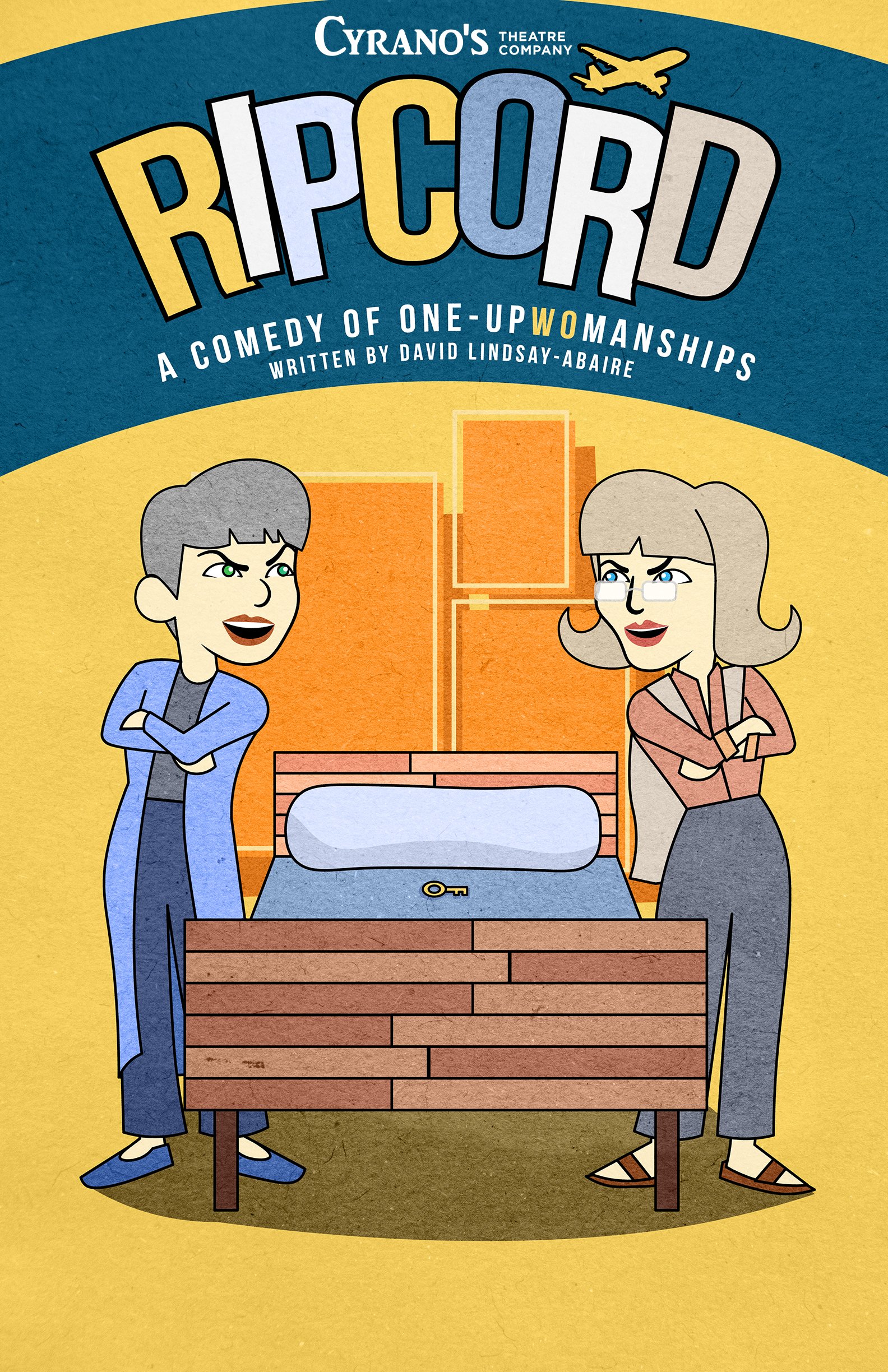
Print Design
Derived from my passion for movie posters, my print design approach focuses on two key elements that captivate an audience: striking visuals and magnetic composition. I critically evaluate each creation, considering whether it would elicit my attention and compel me to engage with it. By placing myself in the viewer’s perspective, I ensure that my designs possess the same captivating qualities that would resonate with a broader audience.


